
Building a Bold, Healthy Presence Online: The M.E.T. Website Design Process
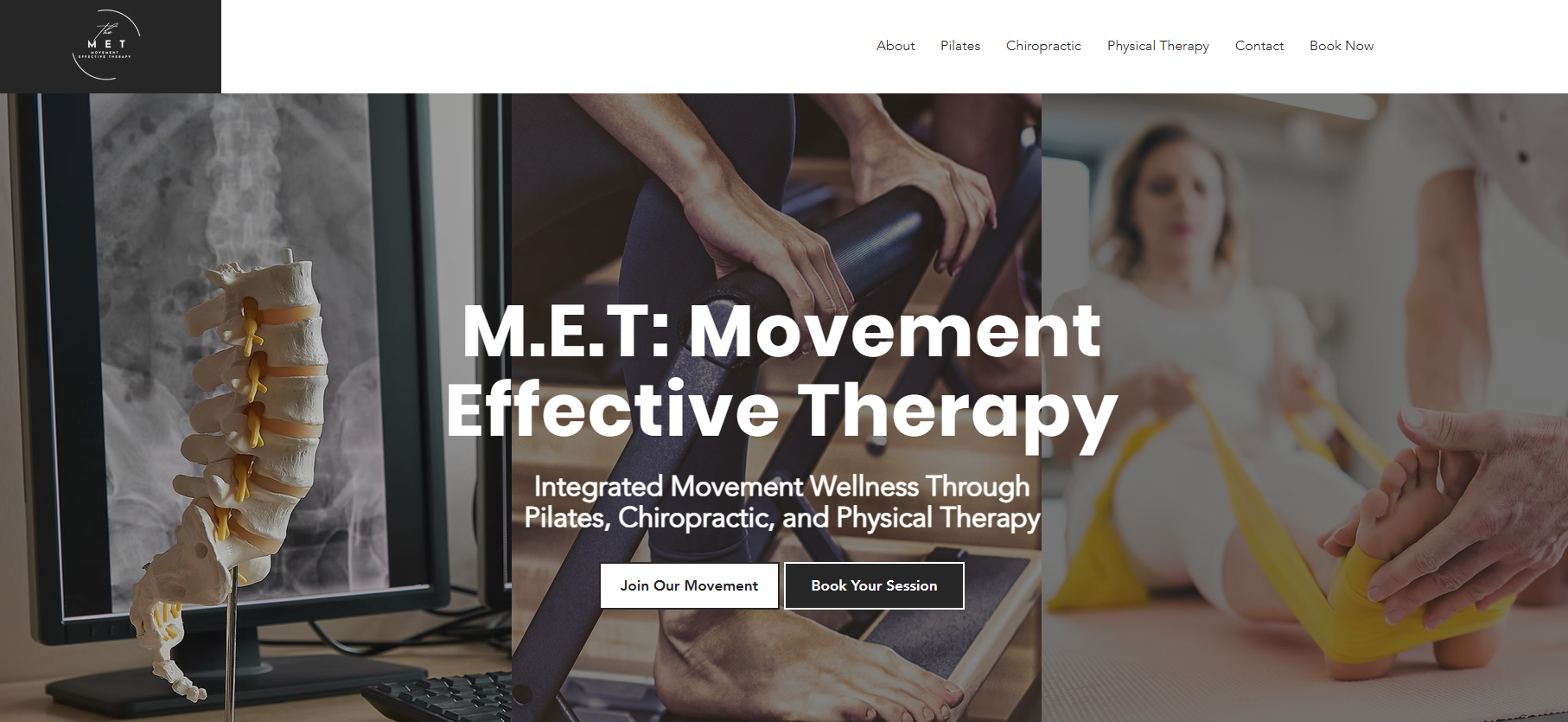
Designing the website for The M.E.T. Movement Effective Therapy was an inspiring process from start to finish. Owner Laise Levin was incredible to work with and had a clear vision from day one. She wanted a strong, confident site that visually felt bold, healthy, and aligned with the level of care and expertise her practice provides. The M.E.T. is not a typical studio. It brings together Pilates, chiropractic care, and physical therapy under one roof, so the website needed to communicate both strength and balance while making visitors feel supported.
We began by mapping out the structure using the foundation we had already defined:
The M.E.T. website is a multi service platform that delivers essential information for a Pilates studio, chiropractic office, and physical therapy practice. Its thoughtfully layered structure presents each offering in a cohesive way that guides visitors naturally through the site.
Because there are multiple services, the organization had to be intentional. Visitors might arrive looking for pain relief, rehabilitation, or fitness, and the site needed to help them quickly find the path that fit their needs. Each service was given its own space while still feeling connected to the larger philosophy of movement based care.
Visually, we leaned into Laise’s request for a bold and healthy feel. We chose strong typography, clean lines, and powerful imagery that reflects real movement and real people. The color palette was kept clean and modern so the design would feel fresh and focused rather than overwhelming. Every choice was made to communicate confidence, professionalism, and vitality.
One of my favorite details is the selective animation throughout the site. It is subtle and purposeful, designed to give a sense of motion without distraction. That movement mirrors what happens inside the practice every day, helping clients restore strength, mobility, and confidence in their bodies. It creates a quiet connection between the digital experience and the in person one.
Just as important as the visual design was the tone. The site needed to feel knowledgeable and clinical enough to build trust, while still being warm and encouraging. People seeking these services are often dealing with pain, recovery, or uncertainty. The messaging had to reassure them that they are in capable and caring hands.
The final result is a website that feels strong, grounded, and alive. It reflects Laise’s passion for helping people move better and live healthier lives, while making it easy for visitors to understand exactly how The M.E.T. can support them. Projects like this are always special because the design is not just about aesthetics. It is about capturing the energy of a space and translating it into something people can feel the moment they land on the page.
Working with Laise on this project was a reminder that when a client has a clear vision and a genuine mission, the design process becomes something truly collaborative. The finished site is bold, healthy, and purposeful, just like the practice itself.